So you’ve designed the PERFECT website but you haven’t seen an increase in engagement. It could be that your site is missing a very important element, a call to action. But what is a call to action (CTA) and why is it vital to your site’s success?
A website’s call to action is a link, button, or graphic element that encourages a visitor to take a specific action. CTAs are a simple and effective way to generate a conversion and ultimately boost sales/engagement. Below we’ll share 3 general rules for CTA’s:
1. Tell Them What To Do Next
You should always let your visitors know where you want them to go next when they visit your site. If you don’t let them know, your competition will.
Always make sure you are directing them to the next step in the sales/engagment process. Whether you want them to “Buy Now”, “Schedule and Appointment”, or “Download Our White Paper”, make your call-to-action clear and easy.
Oh yeah, “Contact Us” is NOT a great call-to-action. It’s widely used but (in our opinion,) it’s too general and non-specific. Let your visitors know what will happen when they contact you “Contact Us to Schedule an Appointment” or “Contact Us for Your Complimentary Quote”
2. Differentiate
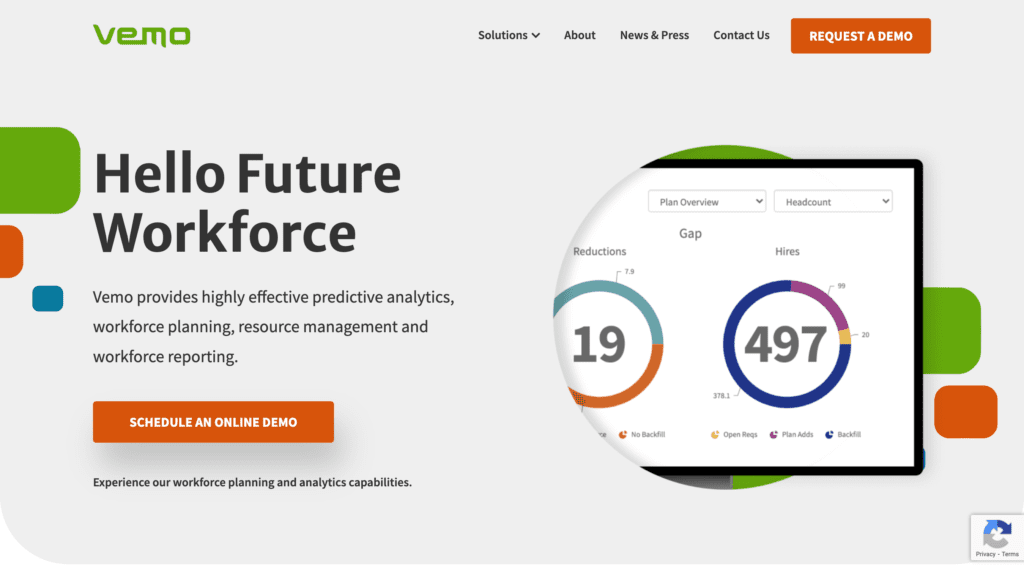
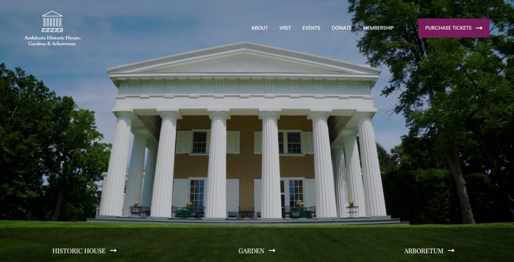
Many times, a main call to action will be found in the header section of a website. Try to make the CTA a different color than the rest of the buttons or links on your site.
If your links or buttons are blue, maybe make the main CTA a bright orange or yellow. But the main goal is make your CTA stand out from the rest of the content on the site.
3. Include a Secondary Call to Action
You always want your main CTA to be seen prominently throughout the website. However, many of your visitors may not be ready to click that call to action. For whatever reason, it’s great to have a secondary CTA where they can get something in exchange for their contact information or email address.
Usually this will happen through what is called a “Lead Magnet” which we will post more about in the coming weeks.
Check out a few great examples of website call to actions below:
Now that you’ve learned what a Call to Action is and seen how easy it can be to guide visitors to take the desired steps on your site, it’s time for you to implement this element on your own site!
When in doubt, remember to keep it simple and watch how adding a CTA can generate conversion and ultimately boost your sales and visitor engagement!


