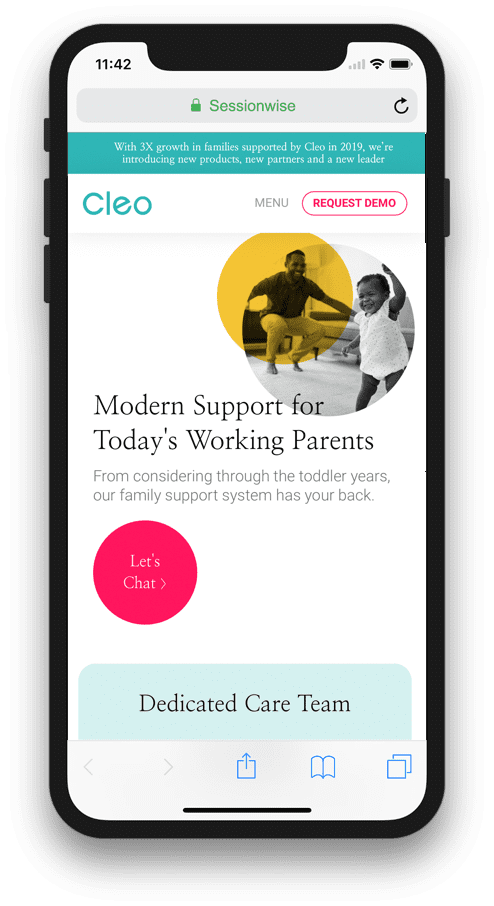
They are both friendly and competent, a perfect combination for a client. They are always available to answer questions, make changes, and take on new projects. The work the team did on the re-design of our (TED Prize) site was fabulous, a great balance of using their design and production expertise and our ideas and needs.
CassonCommunity Catalyst, TED Prize 
One of the great benefits of working with Sessionwise is the sense that you don't even have to think about it. Once you've reviewed the project requirements, they just go off and get the job done. I never felt the need to 'keep tabs' on them to ensure the deadline would be met or the work would meet my expectations. It always did.
Julie SpieglerSr. Experience Design Program Manager at Adobe Inc. 
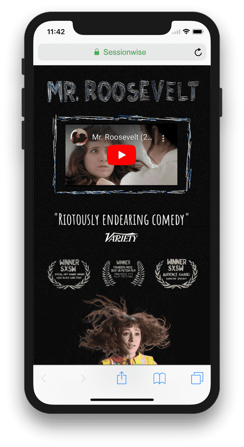
They are always willing to brainstorm ideas, try new things, and rework a page multiple times…without losing patience! They have an incredible ability to suggest small design changes that make a big impact.
Website Director at the San Diego Reader